Now on The Interconnected: Learnability and Common Sense

I’ve got a quest going, and that quest is to talk about the heuristics and theories behind my designs.

It’s one thing to design a big green button to start a process because the primary stakeholder likes big green buttons. It’s another to design a big green button because it needs to be noticeable, inviting, use color cues that for the primary audience’s culture mean “go ahead”, instruct the user, and make the call to action more visible.  The first is client-centered design and that’s got its place in the world. The second is data-driven user-centered design, and that’s my bread and butter.

Similarly, it’s one thing to say that people need to learn a system I’m designing, and it’s another to be able to present my designs with the knowledge that the decisions I made were based on learnability heuristics.

Today’s post on The Interconnected — Learnability and Common Sense — talks a little about why learnability is important, a lot about why common sense isn’t the same thing as good design, and then a whole lot more about what good design for learnability is. Check it out.

Navigating the jotter pad

As someone who works on the web, I rarely see criticisms of physical objects (Design of Everyday Things doors excepted) that this paragraph from James Ward’s Adventures in Stationery delighted me:

I find jotter pads confusing. The spiral binding across the top makes it easy to take notes, flipping each page over at a feverish rate as words are quickly scribbled down, but I gradually lose sense of what is ‘forwards’ and what is ‘backwards’ within the notebook. I get lost by the middle of the pad. Normally, when trying to find a particular note or idea I hurriedly wrote down, I can at least remember if it is on the left or right page of the notebook or pad and then try to find it that way. The jotter pad offers only vague locative information. That crucial scribble could be anywhere. Notebooks need a ‘search’ function.

Yes, exactly, the sense of environment and direction of a physical left-right page book or notebook is critically important. I can find content in my physical copy of CSS Pocket Reference at ten times the speed I can find it in the Kindle version, and not just because I wrote notes in every margin. There’s both physical and visual memory associated with one’s place in a physical book; the weight of the pages on one side or the other, the look of the way the pages curl, the depth perception of the edge, all contribute to remembering one’s place just as much as the content.

The fact that this happens in jotter pads should have given us a bit of a warning that it was also going to happen on tablets and smartphones. But, humans, meh, what can you do?

Accessibility, Recovery, and Posters

It’s been a bit crazy around here.

On February 3rd, my scheduled article for The Pastry Box, Recovery, went up. That was, as usual, exciting for me. This month’s post was about being kind to yourself, because you can. People seem to like it a lot.

So my phone was already buzzing with twitter notifications as different folks found and commented on that post, which made me pretty happy.

Then about mid-morning, A List Apart posted Reframing Accessibility for the Web, a piece I wrote about ableism, accessibility, and testing strategies that move accessibility into technology. That’s when my phone started vibrating off my desk.

The article, which has been read and tweeted about more times than I can count, has been very well-received. The most an author can accomplish is to get people thinking — anything beyond that is a bonus. Based on the comments and feedback I’ve gotten, I’ve gotten people thinking, and that makes me very satisfied indeed.

It’s also gotten me remembering the requests I’d received for a printable version of An Alphabet of Accessibility Issues back in July.

So here it is, better late than never, an Alphabet of Accessibility Issues PDF that you can download and print onto whatever size paper you happen to have available. Hang it around the office, in the lobby, or wherever you work on your design and development stuff. Update: thanks to the fine folks at Emerge Interactive the PDF is now tagged for better accessibility!

As for me, I’m thinking of something more oriented toward design heuristics for my next piece. It’ll be fun.

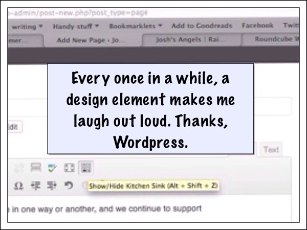
Whimsy

It doesn’t disrupt the usability or usefulness of the design. It doesn’t disrupt the readability or distract from the message of the content. It just adds a smile.

20131004-000322.jpg