I’m bringing Perpendicular Angel Design to the forefront of my career starting in December of 2024.
The short-short explanation is that:
There are multiple members of my family whose disabilities have worsened in the last 12 months.
While most of us picture “caregiving” as handling the basic activities of daily living (ADLs) like eating or dressing the person involved, it’s actually the instrumental activities — managing medical appointments, managing the household, etc. — that eat up a ton of time.
Those same activities mostly have to be done during “standard work hours” because the specialists we see work the same hours we do.
I’ve reached a point where it’s more important for me to project manage the Gibson house than it is for me to project manage a design system or a financial product.
But people gotta eat, right? The bills won’t pay themselves and the Mega Millions is stubbornly not picking my numbers.
Over the next few months you’ll see activity ramp up here, as I take on (and look for) what I call “odd jobs”.
You want someone to consult on a startup you’re building, or provide (light!) design work.
You’d like me to present a talk based on An Alphabet of Accessibility to your organization.
You need someone to thoughtfully content audit or migrate some content from A to B for 10 hours a week.
You haven’t touched your portfolio in two years and your employer’s hinting at layoffs.
You want to migrate off of WordPress. (I’m still working on this one! Large learning curves ahead!)
Something else! Let me know!
I’ve been doing freelance design and development work on occasion since the Geocities days, so when you reach out, you’ll know that you’re speaking to someone who cares about quality, accessibility, and common sense design. I look forward to it!
For those of you not on blue sky (the social media app) or even some of you who are: there’s an app called deck.blue that serves up blue sky in a tweetdeck (multi-column) interface that I’m trying out because the blue sky app won’t hold the place that I left off and let me go back to it.
Turns out deck.blue won’t do that either (is there a tweetbot for bluesky yet?) but while discovering that, I also discovered it has, well, janky scroll animation. I’m not sure I want to call it scrolljacking since this whole app (and all the other social media apps) is steeped in so much scripting that they all seem to write their own scrolling, but I digress.
When I asked them to stop it they asked me to clarify and I took a video of my screen and, well, here we are.
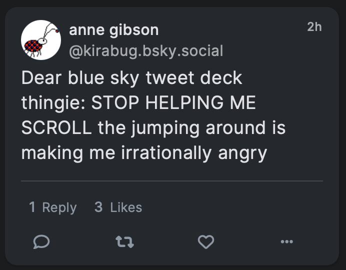
Hi! Sorry I’m posting this on my blog but deck.blue won’t let me upload a .mov file or an .mp4 file of my screen so I’m posting here.
I wrote:
Dear blue sky tweet deck thingie: STOP HELPING ME SCROLL the jumping around is making me irrationally angry
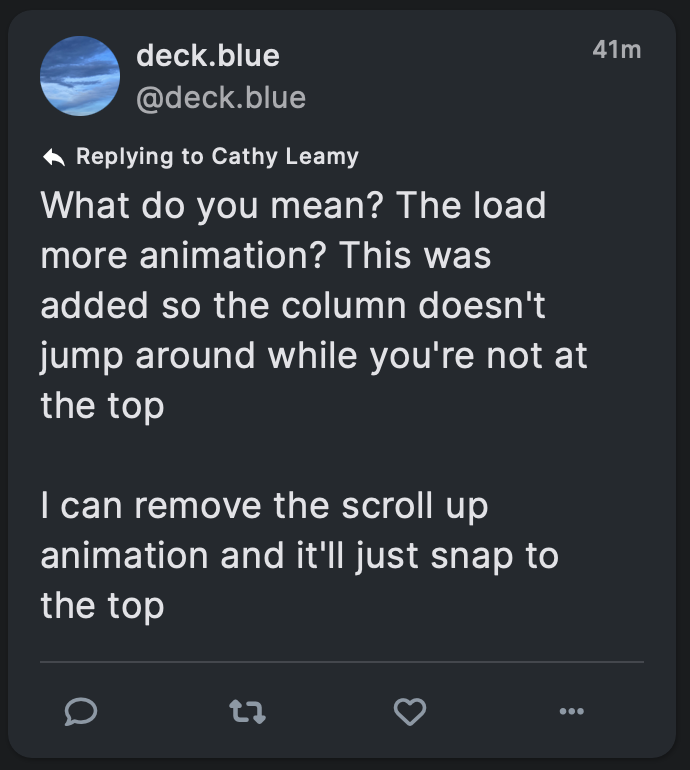
You replied:
What do you mean? The load more animation? This was added so the column doesn’t jump around while you’re not at the top
I can remove the scroll up animation and it’ll just snap to the top
So let me clarify a few things because I’m not sure we’re talking about the same thing and even if we are, I’ve done enough tech support to know me setting context will help you.
I’m on Safari 16.6 on a MacBook Pro running the latest Ventura update.
I’ve got active accounts on twitter, Facebook, LinkedIn, tumblr, three Mastodon instances, Blue Sky, tiktok, Instagram[1]technically, it’s so damn annoying to use I avoid it and probably a few dozen come-and-gone social media accounts.
With the exception of tumblr[2]because tumblr’s threading mechanism is much more thorough than anyone else’s, mostly, plus I’m not reading the news on there, and tiktok [3]which doesn’t have anything one could call an “order” it’s just chaos you can flip through I read all of them in chronological order. Not reverse chronological order, actual chronological order.
In Tweetbot, on twitter that was easy because when I closed the app, it remembered what tweet I was looking at, and when I reopened the app I was still looking at that tweet, just with a lot more new tweets loaded “above” the screen that I had to scroll up to.
Since Tweetbot’s demise, my usual routine is to open a site, scroll down my feed until I recognize something, then slowly scroll up reading each post in turn, until I reach the top again. That way the posts make sense and I get to see everyone I’m following. (I don’t follow a lot of people on any given service because I learned on twitter that I’ve only got the time to read about 200 people worth of posts a day.)
What’s the issue?
The problem with deck.blue isn’t scrolling down, it’s my slow scroll up. I’ve got all the most recent skeets loaded loaded in memory I presume, because i just scrolled past them to get to my starting point. And as I scroll up, things seem smooth for a bit. Then suddenly the feed will jump down like half the distance of the column.
Alt text for video: Video of the column scrolling smoothly, then jumping position, then scrolling smoothly, then jumping position again. No audio. Sorry this alt is so pants, I’m still trying to figure out how to get wordpress to cooperate some days. Similar apologize if the video is taller than your browser.
So why’s this an issue?
First, as Nielsen-Norman point out about scrolljacking:
When it comes to scrolling, users have strong mental models: they expect to scroll vertically, at a consistent rate that is related to how they are physically interacting with their input device.
In most computer operating systems, the default scroll speed can be manually adjusted to be more sensitive or less sensitive, but it is always consistent. Users expect a consistent scroll rate across all the applications on their devices.
When a website alters the default scroll functionality, it “hijacks” the user’s control over their device and can generate disorientation.
So right off the top this is a usability issue because it breaks the user’s mental model, and when my mental model is broken I get grouchy and annoyed.
Second, there are a lot of people who find it easier to read when they have a strong visual anchor that they can associate with the line of text they’re currently reading. For example, people with dyslexia often find it easier to read printed (paper) text when they have a reading ruler to help them focus on a single line of text at a time.
A reading ruler works by reducing visual distractions and increasing focus. People with dyslexia often experience visual stress when reading, which can make it difficult to concentrate on the text. A reading ruler can help to reduce this stress by blocking out surrounding text and highlighting only one line at a time.
Now, I don’t have dyslexia, but I do find it much easier to read when I can reduce visual distractions and increase focus. I’m pretty sure everyone does. Over the (many) years I’ve worked on computers and the web, I’ve made it a habit to pick a specific location — usually the top of a window, but sometimes further down, with my pointer right next to the text — that marks the line I’m reading. Instead of reading down the page, I use the scrollbar to move the line of text I’m reading to my “reading ruler” point.
So when I’m reading something and then because of inconsistent scrolling speed a totally different set of content has moved to my “reading ruler” point, I get really damned frustrated. Now I have to scroll down, find what I was reading, move it back to my reading ruler point, and then continue reading — until it happens again. [4]This is also why sites that play hide-show games on scroll with their global headers can get in the fucking sea. Looking at you, Medium. STOP MOVING MY READING RULER YOU BASTARDS.
As a designer, then, I find this technical “glitch” to be bad design because it undermines the user’s mental model. As an accessibility professional, I have concerns that it increases difficulty and/or destroys the ability for someone with a reading disability like dyslexia to follow the content. As an armchair developer I have no idea why something would unevenly scroll when the content’s already loaded. [5]I suspect it has something to do with the skeet height? But have no idea why?
And as a user, well, I’m really hoping this is something you can fix, because I think it will give you a much more effective application. Bonus points if you can do the same thing as Tapbots and let me read in chronological order without having to find my place every time I launched the app or walked away for a few minutes.
Anyway, all of this isn’t to name-and-shame, it’s to say hey, here’s the problem I’m having, I can’t post my video on the app so please excuse me for using my blog, and maybe the people following along will learn some stuff about scrolljacking and accessibility and dyslexia while they’re here. Thanks for listening!
This is also why sites that play hide-show games on scroll with their global headers can get in the fucking sea. Looking at you, Medium. STOP MOVING MY READING RULER YOU BASTARDS.
It’s important to own a dog (or five) because dogs are Nature’s way of saying “Hey! It’s 1am. If you had logged out of work on time you wouldn’t need to go stand in the rain and cold now. So get moving when they tell you to next time!” [1]Cats may be just as useful. I’ve never had one. None of my cat-owning friends have been dragged out into the snow at 3am by a kitten that got too many naps while Mom worked and wants to take an … Continue reading
Cats may be just as useful. I’ve never had one. None of my cat-owning friends have been dragged out into the snow at 3am by a kitten that got too many naps while Mom worked and wants to take an hour to find a spot to pee though.
First, a note: this review is of the first edition of the Design Is a Job, not the recently-released second edition. I’ve read a lot of A Book Apart books and I can tell you that their second editions have never produced a worse book than the first edition — and the first editions are always excellent. So go get the second edition if you can.
I bought this book when it came out because I saw Mike give a presentation about being a good designer, probably at An Event Apart. I then stuck it on a shelf. That was about 10 years ago, when I was still an arrogant snot-nosed designer raised in the Philly area who thought she knew it all. Considering Mike’s reputation for much of the same (including the Philly) someone should have shoved the book in my hands, chained me to a chair, and said “LEARN.”
Now I’m 15+ years into my career as a UX Designer and knowledgable enough to know that if I want to to keep being an arrogant know-it-all designer I have to do better at knowing it all, and I have to work on my delivery. There’s only so many times in your life that you can get away with having “Must work on communication skills” will show up on your review before everything else about your growth won’t matter. Fortunately, I learned that a few years ago, and now I’m actually listening to people and, damn, that makes work easier.
This book will teach you those lessons faster, if you’re willing to learn. If you’re willing to learn, this will teach you how to work with a lawyer, what belongs in your contracts, how and why to talk about money, and how to present. If you’re not willing to learn, this book will present reasons on why you should be willing to learn, which hopefully would have penetrated my younger thick skull.
Mike’s examples are clear and concise, truthful while still keeping everyone’s privacy appropriately, and constructive. Also, he’s funny.
Talking to teens about sex is a lot like talking to designers about contracts. “We’re being careful. We’re in love. We trust each other. They have an agile process. He promised there wouldn’t be any backend development.
More than anything else, what Mike brings to this book is his desire to see you succeed as a designer, whether you’re working inside a big corporation or as a consultant or at an agency or on your own. He emphasizes treating our peers in the industry with respect, so that we can all raise the quality of design in the industry and, presumably succeed even more.
If you are any kind of designer, content strategist, product manager, or even engineer, read this book. You’ll find ways to improve your working relationships with others as well as ways to produce and execute better ideas, wherever you are.
When I first started working in User Experience, my mentors explained to me that part of my responsibility as a designer was to pass on to others what I had learned. My team exemplified that ethic: they were running the IA Summit that year, most of them had given at least one presentation about the things they’d learned at work, and one was writing a book.
“Someday, that will be you,” they said. “You should write a book.”
I was shocked years later to find out that not all UX teams or leaders believed it was our responsibility to pass on what we’d learned. Still, I knew enough people who, like me, felt that passing on our knowledge was one of the responsibilities of a good designer, so I found myself writing a column on a design-related site, then launching my own design-related site with some friends, then giving talks about the things I’m passionate about. But finding time to write a book? Hah.
Now I’m in a situation where the time has been thrust upon me. I don’t particularly like public speaking, and I’d much rather not attend a mess of conferences in our not-quite-post-COVID 19 world. Writing a book seems like a reasonable choice. Still, I am not usually a person to take big risks.
You Should Write a Book by Katel LeDû and Lisa Maria Marquis is a critical book for people like me, who don’t want to move forward without some guideposts and who don’t want to bug their friends for hints or tips.
It does not go into depth about every single step. (There are lots of resources that will provide that for you, and they are dependent on the choices you make on how to write, polish, and publish your book.)
It does give you the map of the process, the understanding of why each of the process steps is there, what differentiates one choice for another, and a pretty deep appendix of next-step sources.
It is also intentionally written to encourage both non-marginalized and marginalized writers. The authors acknowledge in the beginning that they are “college-educated, able-bodied, cis white American women whose direct book-publishing expertise derives mostly from a single organization: A Book Apart. While we hope our perspective is useful, it is also bound to be limited in certain respects.” These authors essentially say that the process for publishing a book is the same for both marginalized and non-marginalized authors, except that that marginalized authors have to do it on hard mode.
This book will not tell you how to choose whether to self-publish or not. It will tell you about self-publishing and what the differences between it and traditional publishing are. It won’t tell you where to find editing or marketing services. It will tell you what they are and why you want them. It won’t tell you what to write about. It won’t tell you what anything costs — those numbers go out of date too quickly anyway. It will gently laugh at you if you think that you can retire on the money from one book.
Because the authors are deeply and intimately familiar with the publishing house A Book Apart, where they both work, they are able to not only give you insights into ABA’s publishing methods but also give you insights from ABA’s authors, who they’ve spoken to about the publishing experience.
In short, all models of the publishing industry are wrong, and this one is useful.