Not-confidentially to the folks at deck.blue

For those of you not on blue sky (the social media app) or even some of you who are: there’s an app called deck.blue that serves up blue sky in a tweetdeck (multi-column) interface that I’m trying out because the blue sky app won’t hold the place that I left off and let me go back to it.

Turns out deck.blue won’t do that either (is there a tweetbot for bluesky yet?) but while discovering that, I also discovered it has, well, janky scroll animation.  I’m not sure I want to call it scrolljacking since this whole app (and all the other social media apps) is steeped in so much scripting that they all seem to write their own scrolling, but I digress.

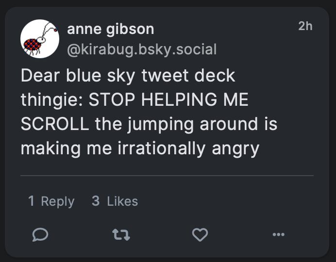
When I asked them to stop it they asked me to clarify and I took a video of my screen and, well, here we are.


Hi! Sorry I’m posting this on my blog but deck.blue won’t let me upload a .mov file or an .mp4 file of my screen so I’m posting here.

I wrote:

see caption text below image for screenshot content
Dear blue sky tweet deck thingie: STOP HELPING ME SCROLL the jumping around is making me irrationally angry

You replied:

see caption text below image for screenshot content
What do you mean? The load more animation? This was added so the column doesn’t jump around while you’re not at the top

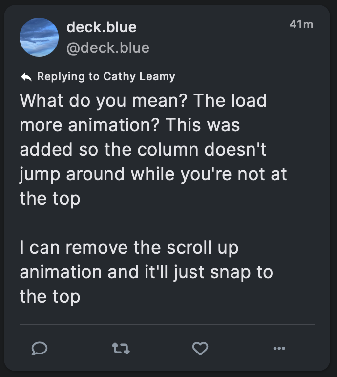
I can remove the scroll up animation and it’ll just snap to the top

So let me clarify a few things because I’m not sure we’re talking about the same thing and even if we are, I’ve done enough tech support to know me setting context will help you.

I’m on Safari 16.6 on a MacBook Pro running the latest Ventura update.

I’ve got active accounts on twitter, Facebook, LinkedIn, tumblr, three Mastodon instances, Blue Sky, tiktok, Instagram[1]technically, it’s so damn annoying to use I avoid it and probably a few dozen come-and-gone social media accounts.

With the exception of tumblr[2]because tumblr’s threading mechanism is much more thorough than anyone else’s, mostly, plus I’m not reading the news on there, and tiktok [3]which doesn’t have anything one could call an “order” it’s just chaos you can flip through I read all of them in chronological order. Not reverse chronological order, actual chronological order.

In Tweetbot, on twitter that was easy because when I closed the app, it remembered what tweet I was looking at, and when I reopened the app I was still looking at that tweet, just with a lot more new tweets loaded “above” the screen that I had to scroll up to.

Since Tweetbot’s demise, my usual routine is to open a site, scroll down my feed until I recognize something, then slowly scroll up reading each post in turn, until I reach the top again. That way the posts make sense and I get to see everyone I’m following. (I don’t follow a lot of people on any given service because I learned on twitter that I’ve only got the time to read about 200 people worth of posts a day.)

What’s the issue?

The problem with deck.blue isn’t scrolling down, it’s my slow scroll up. I’ve got all the most recent skeets loaded loaded in memory I presume, because i just scrolled past them to get to my starting point. And as I scroll up, things seem smooth for a bit. Then suddenly the feed will jump down like half the distance of the column.

Alt text for video: Video of the column scrolling smoothly, then jumping position, then scrolling smoothly, then jumping position again. No audio. Sorry this alt is so pants, I’m still trying to figure out how to get wordpress to cooperate some days. Similar apologize if the video is taller than your browser.

So why’s this an issue?

First, as Nielsen-Norman point out about scrolljacking:

When it comes to scrolling, users have strong mental models: they expect to scroll vertically, at a consistent rate that is related to how they are physically interacting with their input device.

In most computer operating systems, the default scroll speed can be manually adjusted to be more sensitive or less sensitive, but it is always consistent. Users expect a consistent scroll rate across all the applications on their devices.

When a website alters the default scroll functionality, it “hijacks” the user’s control over their device and can generate disorientation.

So right off the top this is a usability issue because it breaks the user’s mental model, and when my mental model is broken I get grouchy and annoyed.

Second, there are a lot of people who find it easier to read when they have a strong visual anchor that they can associate with the line of text they’re currently reading. For example, people with dyslexia  often find it easier to read printed (paper) text when they have a reading ruler to help them focus on a single line of text at a time.

A reading ruler works by reducing visual distractions and increasing focus. People with dyslexia often experience visual stress when reading, which can make it difficult to concentrate on the text. A reading ruler can help to reduce this stress by blocking out surrounding text and highlighting only one line at a time.

Now, I don’t have dyslexia, but I do find it much easier to read when I can reduce visual distractions and increase focus. I’m pretty sure everyone does. Over the (many) years I’ve worked on computers and the web, I’ve made it a habit to pick a specific location — usually the top of a window, but sometimes further down, with my pointer right next to the text — that marks the line I’m reading. Instead of reading down the page, I use the scrollbar to move the line of text I’m reading to my “reading ruler” point.

So when I’m reading something and then because of inconsistent scrolling speed a totally different set of content has moved to my “reading ruler” point, I get really damned frustrated. Now I have to scroll down, find what I was reading, move it back to my reading ruler point, and then continue reading — until it happens again. [4]This is also why sites that play hide-show games on scroll with their global headers can get in the fucking sea. Looking at you, Medium.  STOP MOVING MY READING RULER YOU BASTARDS.

As a designer, then, I find this technical “glitch” to be bad design because it undermines the user’s mental model. As an accessibility professional, I have concerns that it increases difficulty and/or destroys the ability for someone with a reading disability like dyslexia to follow the content. As an armchair developer I have no idea why something would unevenly scroll when the content’s already loaded. [5]I suspect it has something to do with the skeet height? But have no idea why?

And as a user, well, I’m really hoping this is something you can fix, because I think it will give you a much more effective application. Bonus points if you can do the same thing as  Tapbots and let me read in chronological order without having to find my place every time I launched the app or walked away for a few minutes.

Anyway, all of this isn’t to name-and-shame, it’s to say hey, here’s the problem I’m having, I can’t post my video on the app so please excuse me for using my blog, and maybe the people following along will learn some stuff about scrolljacking and accessibility and dyslexia while they’re here. Thanks for listening!

Footnotes

Footnotes
1 technically, it’s so damn annoying to use I avoid it
2 because tumblr’s threading mechanism is much more thorough than anyone else’s, mostly, plus I’m not reading the news on there
3 which doesn’t have anything one could call an “order” it’s just chaos you can flip through
4 This is also why sites that play hide-show games on scroll with their global headers can get in the fucking sea. Looking at you, Medium.  STOP MOVING MY READING RULER YOU BASTARDS.
5 I suspect it has something to do with the skeet height? But have no idea why?

Sustainable Web Design by Tom Greenwood

I’ve know that there is a movement to make the web more sustainable for a while, but Sustainable Web Design, written by Tom Greenwood, is the first book I’ve read about it. I read the book, honestly, because it’s from A Book Apart, and I give pretty much everything they publish a read.

I’m recommending the book, however, because it illustrates that sustainability is one more excellent reason to run an efficient, cleanly-coded, performant website.

An efficient site lets a user do the task they arrived to do in the fewest possible understandable steps, and with the fewest possible distractions.

A cleanly-coded website has less code cruft, takes up less server space, takes up less time to transmit from place to place, and has fewer errors.

A performant website also takes up less server space and less time to transmit from place to place. Additionally, it makes the web feel “snappy” and increases user confidence and satisfaction.

All of those things help us burn less electricity (both as the web consumer and — more importantly — as the web producer), and as a result, increase the sustainability of the internet. Considering that the internet is, as Tom Greenwood puts it, a coal-fired machine, any increase we can make is progress.

Sustainability is important, but sustainability isn’t my passion in UX (at least right now). My passion is seeing that coal-fired machine become more accessible to people with disabilities and users in general.

Turns out that efficiency, clean code, and performance <i>also</i> increase accessibility. Especially when we’re talking about things like “yo how about you remove those eleventy billion javascript frameworks that aren’t accessible, eat a ton of server space, and make loading times agonizing, and try plain static html instead?”

We all have our passions in UX, and that’s good. It helps to keep the larger culture balanced. But it’s also excellent when we can places where our different goals can be met together using common techniques.

Whether you’re passionate about sustainability, accessibility, or just plain great UX, whether your interest is in software, hardware, or managing data centers, whether you are a lifelong tech geek who remembers when everything had to fit on a floppy disk or you’re new to the web and don’t remember a time before Amazon.com, Tom Greenwood’s book will have suggestions for how you can make your products, and our planet, more sustainable. And probably hit a good number of your other life goals on the way.

Quiet in a time of change

You may have noticed that the site has become… well… UX-related book reviews mostly.

That’s not an accident — I’m reading more than I have in decades, and I do my best to review good books because reviews are a driver for sales, and good authors deserve to be rewarded for being good authors.

But it’s also an acknowledgement that I’m not talking about much else in UX right now. Even on The Interconnected, which is my usual ranting locus, the site was virtually silent last year.

Last year, I think we can all agree, was rough.

This year so far is better but that doesn’t mean much. When I walk the half marathon in Virginia Beach, mile 11 over the damned bridge is hell, but it being stupid hard doesn’t suddenly move the finish line closer.

Still, I think there’s a finish line around the corner, so I shall trudge on until I can fall onto the beach and soak my feet in the ocean.

Things that are looking up:

  • I have a new job at Vertex, Inc. where we design software that calculates sales tax and VAT. I am pro-fair-taxes and also pro-make-taxes-easy, and in a lot of places (for better or worse) sales taxes fund lots of important local initiatives, so at least at the moment it feels like a good fit. I’m two months in and I haven’t seriously pissed anyone off yet, but the day is still young.
  • I’m seeing more and more people in our industry concerned about accessibility and making things more equitable for all, regardless of disability. I refuse to say that the pandemic has any silver linings with 500,000 dead in my country alone. I will say that hard-earned lessons are still lessons, and hopefully we’ll come out of this with more accessible jobs, more accessible websites, and more people giving a damn about their own impacts on their neighbors’ ability to survive in an increasingly technical world.
  • While we’re on the subject of survival, there’ll be a review coming up sometime soon on Sustainable Web Design by Tom Greenwood. I’m about halfway through now and already recommending it to coworkers. Many of the goals in the book align with accessibility goals and good information architecture goals, so I think it could become an asset in convincing our higher-ups (especially in enterprise product design) that good web design = good business, both on the surface and within the code.

I’m also working (slowly) on my own accessibility website, trying to bring together information from the WCAG and the Deque online training classes I’m taking, articles that I rely on, other books, etc.. The ultimate goal is somewhere that people can navigate through a list of components and find something that says “Oh, buttons? Here are all the WCAG guidelines, info on how to hit them, and info on how to test them, all in one place.”

That’s taking longer than I thought it would because

  1. pandemic;
  2. constant exhaustion;
  3. I am the world’s worst estimator.

May you also be within sight of the next milestone, and may your strength hold out until you get there.

Button is coming and I’ll be there [for some value of “there” in a remote context]

Y’all.

Y’all, I just finished uploading my talk, Decide to give a damn: an alphabet of accessibility to Button and I’m super excited about it. This is probably the best version of this talk yet — and I’ve been giving this talk to some pretty solid acclaim since 2017.

Registration is still open, and the conference is fully remote! It even takes time zones into account! Join me at Button this fall for the product content event of the year. On October 21-23rd, all of your favorite content and design nerds will be gathered for conversation, community, and fun! Check out the program and register today https://www.buttonconf.com/program

A deck of accessibility issues

Cross-posted from The Interconnected

Back in February, I wrote about the events that brought about the Alphabet of Accessibility post on The Pastry Box, and I hinted I might have a deck of cards to accompany it soon.

I opened the mail today and discovered that my prototype deck arrived. The Alphabet of Accessibility Deck is a real thing you can purchase with actual money from over at The Gamecrafter.

A box for the accessibility deck, with the deck, with letter z on top

I’m a little overwhelmed. When I wrote the original alphabet back in 2014, I certainly didn’t expect it would ever become a talk, much less a talk, a deck of cards, and a half-formed workshop.

But here we are, dragging the world forward kicking and screaming into the Century of the Anchovy, as Terry Pratchett would put it. And you can buy the deck and share it with your teams or your organizations or whatever you’d like.

Many thanks to Dylan Wilbanks, Jeff Eaton, Sarah Hoffman, Elaine Nelson, and Greg Dunlap (as well as many others!) for encouragement, sanity checks, and pointing me to The Gamecrafter. And all of my friends and family, who will continue to remain nameless, for their love, support, and well-earned right to complain about the things we still don’t get right when we design.