Presenting Design Work by Donna Spencer

Presenting Design Work by Donna Spencer captures everything I’ve learned about that harrowing process of presenting a web design for review and turned it into a six chapter book you can read over two lunch hours.

I am thrilled that this book emphasizes rigor in the craft of creating and presenting designs.

So many times I’ve sat through reviews where the designer couldn’t tell me what the business problem was, why the user needed the changes, how the user would get from place to place, or what the unhappy paths looked like. They failed to take notes (sometimes showing up without even a note-taking device, like, say, a pencil or a laptop), gave me a tour of our components on the page instead of telling me how someone would use it, and thanked everyone when done — but never followed up to let us know what they’d decided. Then, later, they complained that the product manager steamrolled their input on designs or ignored their feedback.

This book demands a lot of the person who wants to be successful. You have to think about your audience, practice presenting, take notes (or find someone who will), understand the problem you’re building against, understand the feedback you’re given, and be rigorous in your feedback decision-making process.

It also works. It works so very well. And it garners trust between us and our business and engineering peers way better than any less-rigorous process is capable of doing.

As soon as I started reading it, I started messaging people I know mentoring designers and said “yeah this book? this is the one you want.”

Am I Overthinking This? by Michelle Rial

Am I Overthinking This? is a delightful book of 101 infographics. In the introduction, Michelle Rial explains that she was an information graphic designer whose chronic pain removed her from the field… and that this was her response.

This is the perfect coffee table book for the introverted UX designer who thinks way too hard about the little things, like:

  • Where are my hair ties?
  • Is brunch fiscally irresponsible?
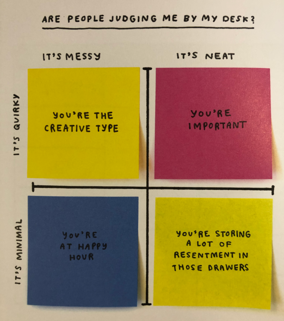
  • Are people judging me by my desk?
  • Is it too late to start?
  • Am I a bad friend?
  • How much do I tip for this?
  • How do I stay calm?

Michelle uses everything from water colors to markers to hair ties, matches, and Chinese food take-out boxes to create the info graphics that are in the book.

For example, here’s “Are people judging me by my desk?”

Photo of the book page. The quadrant chart can be broken down to the following desk value combinations. Mess and quirky: you're the creative type. Neat and quirky, you're important. Messy and minimal, you're at happy hour. Neat and minimal, you're storing a lot of resentment in these drawers. The chart axis and labels are drawn on a piece of paper, but each of the values (which fills its whole quadrant) is a post-it note.

If you are an overthinker, or you are an information designer, or you just like charts (or you know anyone who fits any of these combinations) this is a book worth buying. I foresee using it to hand out “advice” to many of my friends in the future.

Everyday Information Architecture by Lisa Maria Martin

I’m a three-time failure at reading the Polar Bear Book.

I’m also a Principal Information Architect with 10 years’ experience.

I’m not telling you not to read the Polar Bear Book. I am telling you that if you want a short, direct, and well-structured book on what Information Architecture is, how to get started practicing it, and real-world examples of prior work, Everyday Information Architecture by Lisa Maria Martin is the book to start with.

It is the IA cohort to The Elements of Content Strategy And y’all know I’m a big fan of that book.

I started this book while sitting in a hospital room watching my husband sleep. It’s readable even under extreme stress. The book starts with the LATCH system of organization, which I had learned… but when I’d learned it through the quasi-apprenticeship of a mutual fund company’s design department, it didn’t have a name. So here I was, middle of the afternoon, snoring and beeping filling the room, and ten-year veteran of information architecture, learning things I didn’t know on page 5.

Your milage may vary (YMMV), especially if you’re one of those younger folks for whom information architecture degrees were available. (We had library science but I was too short-sighted to major in it.)

The book is vibrant and well-structured enough that I could put it down for a week at a time if I needed to and pick it up again and keep reading and understand where I’d left off. (Also, YMMV.)

Plus, this book isn’t afraid to use Star Trek, Ravelry, cooking, self-deprecating spreadsheet jokes, and colorful, useful examples.

To sum up, this book is going on the list of books anyone who asks me how to start a career in UX, along with Don’t Make Me Think, How to Make Sense of Any Mess and Universal Principles of Design.

Now on The Pastry Box: Welcome to Enterprise

This month’s Pastry Box post, Welcome to Enterprise, is really a bit of a rant about user experience design vs. client experience design. Client experience design is when we design something that makes the paying client happy. User experience design is when we work with the client to make the end-user of the product happy. In doing so, we align the users’ needs with the clients needs (and/or make the client aware of irreconcilable differences) and make everyone satisfied.

It’s called Welcome to Enterprise because a) I work in Enterprise software and it’s what I know best, and b) pretty much everyone in Enterprise thinks that *they* are who I’m working for.

I’m not. It’s my job to advocate for the end user, and bring everyone else around to do the same. That’s what UX in Enterprise is about.