I just came from a great first day of the An Event Apart conference in Seattle and I am both extremely inspired and motivated, and a little flustered.
I blame Jared Spool.
Jared is a) a great guy, b) a masterful speaker, and c) a wonderful source of information and thinking around the web, it’s strategy, what work, and what doesn’t. If I’m going to be irritated by something (and in this case I mean it’s like a brain itch, not like angry) then I’m glad it’s Jared’s talk that’s irritating me.
Jared’s talk today was about the importance of UX strategy to business, and the importance of business strategy to the success of being a UX designer.
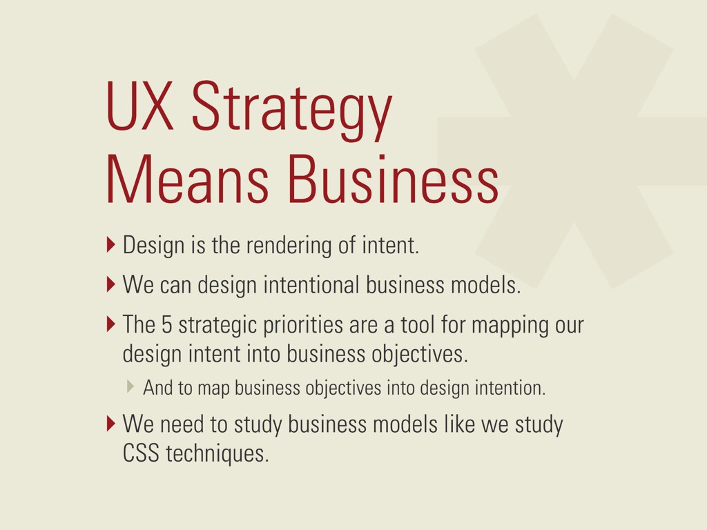
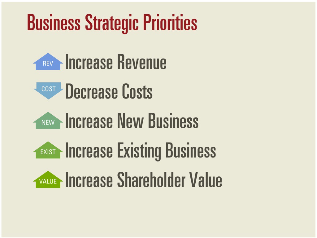
During his talk, Jared explained that design is the rendering of intent. Business models are the intent of the business, and most business models can be mapped to one of five categories.
He gave a bunch of great examples of how various elements of companies’ designs (or experiences) mapped back to positive changes to their business strategies. It’s all very good and I’m not going to even try to replicate it here — go see Jared give the talk if you want the details.
So here’s the problem: he used Vanguard’s website’s content and videos about investing and the market as an example of something that couldn’t be mapped back to business strategy. That irritated me because, well, I work at Vanguard, and I often forget that not everyone has seen the way that we work.
See, we have a strong definition of character and values that is built into everything that we do and don’t do. That set of values has, since the beginning, shaped our principles for investing success. There are lots of ways that these values map back to the content on our website, but the biggest (to me) is through education. Smarter investors are better investors. We’re so confident in our investing principles that we actively teach those principles to our investors, so that whether they’re with us or someone else, they’ll be more successful investors.
After Jared’s talk I asked him if he really didn’t know the connection between the content and the business strategies, and explained it to him. He asked, “Yes, but how do you know it works?”
Well, the fact is that I don’t know that the specific article and the specific video that Jared screen snapped work in a measurable. Nor do I know for sure that we’re always eating our own dog food when it comes to design (or how much Legal would let me tell you about that dog food.)
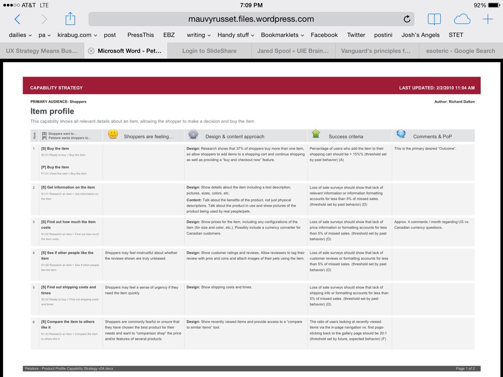
I can, however, tell you about a tool that my then-manager at Vanguard Richard Dalton taught me to use in 2010/2011 called a capability strategy sheet. It connects the dots between the business goals, the user needs, and whether they’re working. It makes user experience measurable.
Here’s a quick run-down of how I use capability strategy sheets on most of my projects as an Information Architect and Generalized Troublemaker.
1. Sit down with the business and learn everything then can tell me about their business goals for a specific capability they want us (the UX team) to help them design.
2. Using a combination of personas and user research we already have in UX, and user research the business has done (which they needed to get funding for the project or they wouldn’t be talking to me), we document our understanding of who the audience/customer/client is and what their goals are.
3. Write down the two lists, then, with the business, prioritize the goals into one giant list. (This step contains a lot of reminders that if all the business goals lead, then no one visits the website, which is amazingly effective especially when you can back it with data from previously failed projects. Keep all your data all the time.)
4. Talk about the client’s environment – inside and outside of their head – for each goal. Are they knowledgable? Frustrated? Afraid? Do they trust you? To be honest, this is the one step I’m most likely to skip, because strong emotions aren’t linked to many of my projects. Still, it’s good to ask yourself if it’s needed before you throw it out.
5. Talk about the current approach and the ideal approach to meet each of these goals. Is there a current approach? Does anyone know how to reach a better approach? These are first passes and we iterate on them a lot both at the strategy level and when we start making detailed screens.
6. Write down the success criteria. This is the critical one. Write down what piece of measurement you can do to see if your design worked. For example, if the client’s goal is to recover a password and the company’s goal is to help the client recover the password without calling, then when the new “recover your password” capability launches, visits to that area should go up, and the number of phone calls should go down.
Sometimes the measurements are easy to map to the capability – call volumes go down. Visits go up. Some times they’re harder to gather. “We should see the complexity of our calls rise because the simple calls won’t come into the call center anymore.” Lots of data needed from the phone teams for that one. Sometimes they’re downright esoteric — did trust go up? You need a good survey (a great usability engineer can help you with that) which will measure trust before and after the launch of a product. And hope that no one blows up some other capability that causes people to lose trust while you’re busy trying to build it.
Map all of it to a giant spreadsheet. Shop it around, get the important people to agree with it. If possible, help them own it. We’re all in it together. These are the things that matter about this capability, and these are the ways we measure whether we’re reaching those goals.
Then, while your starting your wireframes and your personas and all your other deliverables, take your baseline measurements. Or ask your business to take the baseline measurements. Or ask the business to all the business intelligence area to take the baseline measurements. Measure before you cut.
When your project is done and your stakeholders are asking “how do you know if it worked?” (Especially that one that was kind of doubtful you’d pull it off), measure again. Compare the results, disposition the feedback, and know how we you did both as a design organization and as a business.
There are three results to this process.
The first is that when you’re done, when Jared Spool asks whether you can measure the success of your content, you know you can go back to the office and pull the capability strategy sheet for that project, run some measurements, compare them to the baseline, and see if in fact, the capability of serving content in this area of the site that educates the users about this specific thing is working. (I’m not going to, but I know I can.)
If it’s not working, hey, that’s a conversation to have with the business, because their goals are no longer being met and that’s a problem.
The second result of the capability strategy sheet is that now you have a list of the goals for this capability that you and the business signed off on. You have (limited) persona information, the business’s approach, and dashboard metrics all documented in one place.
Six months or six years later when someone comes to you and says, “we want to enhance Capability X to add this thing” you can pull your capability strategy sheet and start the conversation there. “The last time we worked on this, here were our users and goals. Tell me about how your new enhancement fits in with these goals.”
When we start enhancement request with an understanding of the current application’s goals, we help the business remember why we built what we built the first time, and decide whether their Shiny New Thing is better or worse, more or less important, than the rest of that capability. This can help discussions around positioning, priority… It keeps the project team aligned with the culture and philosophy of our company (or helps us change if we’re off course). One memorable time it even resulted in the canceling of a Shiny New Thing that was a Really Bad Idea in light of the existing business strategy and principles.
The third result is that you build up a portfolio of projects as a design group that have actual measurements attached to them. You will have the tools to say to a new stakeholder, “I know this seems like a lot of strategy when all you want is for us to “make it pretty” but here’s the revenue growth / cost savings / measurable results we received from following this process.” It’s easier to achieve buy-in to UX being an effective approach to problem solving when you can measure it.
So, to sum up: yes, business strategy is critically important to design – and design to achieving business strategy, as Jared pointed out today. And it’s not enough to just say, “this content achieves this goal”, you have to be able to prove it. That means you have to be able to measure it. Jared’s talk today emphasized the need, but not the technique, for accomplishing that goal. Richard Dalton’s Capability Strategy Sheets are one tool to move from understanding the business strategy to implementing it in a measurable, and ultimately successful, way.