A deck of accessibility issues

Cross-posted from The Interconnected

Back in February, I wrote about the events that brought about the Alphabet of Accessibility post on The Pastry Box, and I hinted I might have a deck of cards to accompany it soon.

I opened the mail today and discovered that my prototype deck arrived. The Alphabet of Accessibility Deck is a real thing you can purchase with actual money from over at The Gamecrafter.

A box for the accessibility deck, with the deck, with letter z on top

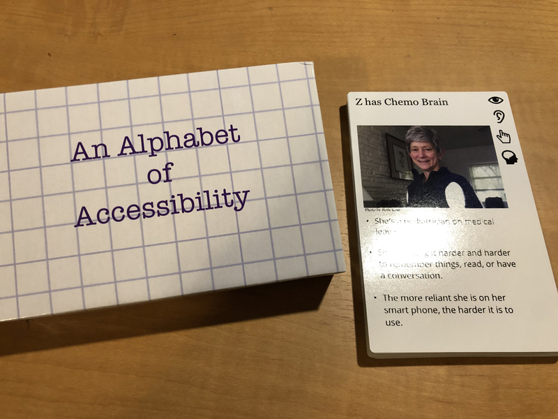
I’m a little overwhelmed. When I wrote the original alphabet back in 2014, I certainly didn’t expect it would ever become a talk, much less a talk, a deck of cards, and a half-formed workshop.

But here we are, dragging the world forward kicking and screaming into the Century of the Anchovy, as Terry Pratchett would put it. And you can buy the deck and share it with your teams or your organizations or whatever you’d like.

Many thanks to Dylan Wilbanks, Jeff Eaton, Sarah Hoffman, Elaine Nelson, and Greg Dunlap (as well as many others!) for encouragement, sanity checks, and pointing me to The Gamecrafter. And all of my friends and family, who will continue to remain nameless, for their love, support, and well-earned right to complain about the things we still don’t get right when we design.

Everyday Information Architecture by Lisa Maria Martin

I’m a three-time failure at reading the Polar Bear Book.

I’m also a Principal Information Architect with 10 years’ experience.

I’m not telling you not to read the Polar Bear Book. I am telling you that if you want a short, direct, and well-structured book on what Information Architecture is, how to get started practicing it, and real-world examples of prior work, Everyday Information Architecture by Lisa Maria Martin is the book to start with.

It is the IA cohort to The Elements of Content Strategy And y’all know I’m a big fan of that book.

I started this book while sitting in a hospital room watching my husband sleep. It’s readable even under extreme stress. The book starts with the LATCH system of organization, which I had learned… but when I’d learned it through the quasi-apprenticeship of a mutual fund company’s design department, it didn’t have a name. So here I was, middle of the afternoon, snoring and beeping filling the room, and ten-year veteran of information architecture, learning things I didn’t know on page 5.

Your milage may vary (YMMV), especially if you’re one of those younger folks for whom information architecture degrees were available. (We had library science but I was too short-sighted to major in it.)

The book is vibrant and well-structured enough that I could put it down for a week at a time if I needed to and pick it up again and keep reading and understand where I’d left off. (Also, YMMV.)

Plus, this book isn’t afraid to use Star Trek, Ravelry, cooking, self-deprecating spreadsheet jokes, and colorful, useful examples.

To sum up, this book is going on the list of books anyone who asks me how to start a career in UX, along with Don’t Make Me Think, How to Make Sense of Any Mess and Universal Principles of Design.

Mobile First by Luke Wroblewski

Mobile First by Luke Wroblewski (Also available from the publisher, A Book Apart, possibly for cheaper depending on your edition. Support your small press publishers!)

I’ll admit I probably should have read this book back when Luke Wroblewski wrote it, but I didn’t think I needed to. I had attended one of the An Event Apart conferences where Luke presented the ideas the book is based on, and I followed him pretty closely on Twitter at the time, so most of what is in the book I’d learned through other means.

But it’s been seven years, and I’m introducing a new company to mobile design for the first time, so it was time for me to take a refresher course. This book was perfect for that task.

The goal of this book is to teach you what it means to design a website or application first from the mindset of a mobile design. It came about because, before mobile, we designed everything for the computer desktop, and after mobile, that sucked pretty badly all things considered. If you don’t remember the era of m-dot sites and dumbphone sites and total lack of iPhones, well, I envy you a little. (Also, go ask an old person about the Netscape browser wars.)

The book promises no code and to keep things short; it delivers on both promises. At the same time it delivers explanations of why mobile is important, how to think about mobile use cases beyond the idea that everyone is doing things “on the go” (they’re not), and a light but effective introduction to how to think about design elements such as touch areas, hover states, form elements, and page layout in a mobile context.

I hope that A Book Apart commissions a second edition, because the first edition is pushing close to 10 years old, and a lot has changed in the last 10 years. I’m not honestly confident that it will make as much sense to someone who just joined the industry as it does those of us who were hand-coding our Geocities sites back in the late 1990s. But regardless of the slightly dated statistics (and screenshots) and the assumption that none of us know what this “mobile” thing is, the theories and mindsets introduced are sound. It’s still a valuable read all these years later.

Update December 2018: The paperback is sold out at A Book Apart and I’m hoping that means there’s a new edition coming out! In the meantime, the e-book is a good deal.

Designing for Emotion by Aaron Walter

Designing for Emotion by Aaron Walter is definitely less expensive if you buy it from the publisher, A Book Apart. As of this writing it’s $41 on Amazon and you can get two of them from ABA for that price. Support small press publishers!

I put off reading this book for a long time because I thought it was about designing for emotional situations. Shows what kind of reading comprehension I’ve got! It’s actually about designing a product or interface to resonate with its own emotion – giving your product a personality and voice and tone.

As a UX Designer, it invites me to think of different interactions that my designs can have with our users – from silly and playful to sincere and human. It talks about techniques for researching both the design persona one starts with and the usability tests one uses when the design persona has been drafted.

Like most of the A Book Apart books, this book isn’t designed to be the be-all-end-all on the topic, but rather an introduction to it, which will give you enough information to move more deeply into designing for emotion either by experimenting or by using the resources listed at the end of the book.

I would’ve liked a few more examples of what can go wrong, but otherwise, it was a well put-together book and one that I thoroughly enjoyed reading.

HTML5 for Web Designers by Jeremy Keith and Rachel Andrew

HTML5 for Web Designers by Jeremy Keith and Rachel Andrew (also available from the publisher, A Book Apart, possibly cheaper)

This book breaks downs a few very important points about HTML5 that other books I’ve read on the topic do not, and they all involve history. Jeremy Keith explains how we got here, from the beginning with HTML 2.0 through the WHATWG and WC3 kerfuffles to the present (2010) day.

Knowing the history of HTML helps considerably in understanding what decisions were made and why. Understanding the design principles — especially in the light of graceful degradation — is also quite helpful.

I read both the first edition and the second edition. The bulk of the second edition changes are dedicated to updating the features and options that have become browser-supported since the first edition came out in 2010. Because of the solid principles Jeremy Keith describes the web standards groups are using, the first edition isn’t inaccurate so much as missing all the cool stuff that’s developed since so if this is the only edition you have access to, it’s still worth the read.