Am I Overthinking This? by Michelle Rial

Am I Overthinking This? is a delightful book of 101 infographics. In the introduction, Michelle Rial explains that she was an information graphic designer whose chronic pain removed her from the field… and that this was her response.

This is the perfect coffee table book for the introverted UX designer who thinks way too hard about the little things, like:

  • Where are my hair ties?
  • Is brunch fiscally irresponsible?
  • Are people judging me by my desk?
  • Is it too late to start?
  • Am I a bad friend?
  • How much do I tip for this?
  • How do I stay calm?

Michelle uses everything from water colors to markers to hair ties, matches, and Chinese food take-out boxes to create the info graphics that are in the book.

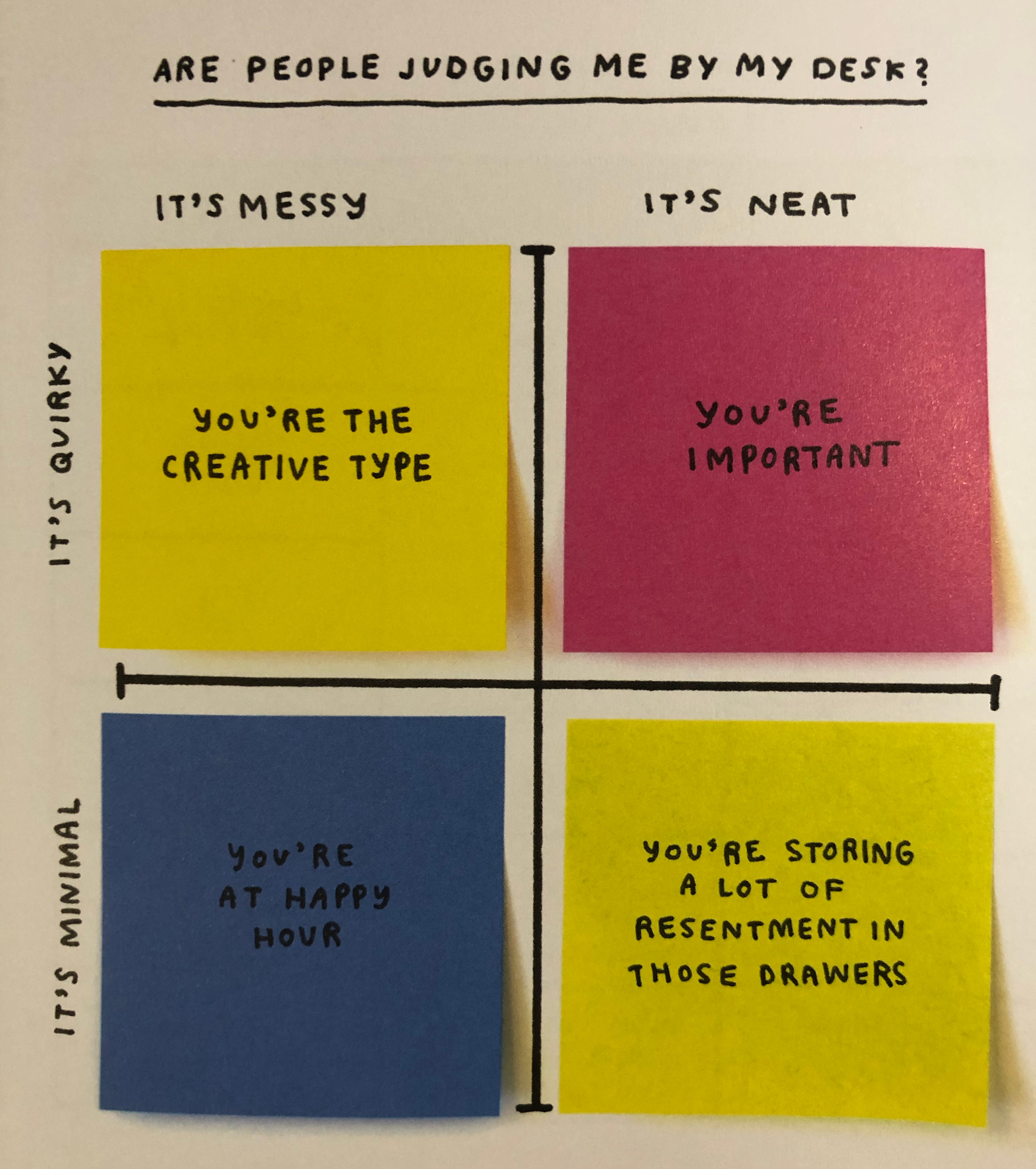
For example, here’s “Are people judging me by my desk?”

Photo of the book page. The quadrant chart can be broken down to the following desk value combinations. Mess and quirky: you're the creative type. Neat and quirky, you're important. Messy and minimal, you're at happy hour. Neat and minimal, you're storing a lot of resentment in these drawers. The chart axis and labels are drawn on a piece of paper, but each of the values (which fills its whole quadrant) is a post-it note.

If you are an overthinker, or you are an information designer, or you just like charts (or you know anyone who fits any of these combinations) this is a book worth buying. I foresee using it to hand out “advice” to many of my friends in the future.

Navigating the jotter pad

As someone who works on the web, I rarely see criticisms of physical objects (Design of Everyday Things doors excepted) that this paragraph from James Ward’s Adventures in Stationery delighted me:

I find jotter pads confusing. The spiral binding across the top makes it easy to take notes, flipping each page over at a feverish rate as words are quickly scribbled down, but I gradually lose sense of what is ‘forwards’ and what is ‘backwards’ within the notebook. I get lost by the middle of the pad. Normally, when trying to find a particular note or idea I hurriedly wrote down, I can at least remember if it is on the left or right page of the notebook or pad and then try to find it that way. The jotter pad offers only vague locative information. That crucial scribble could be anywhere. Notebooks need a ‘search’ function.

Yes, exactly, the sense of environment and direction of a physical left-right page book or notebook is critically important. I can find content in my physical copy of CSS Pocket Reference at ten times the speed I can find it in the Kindle version, and not just because I wrote notes in every margin. There’s both physical and visual memory associated with one’s place in a physical book; the weight of the pages on one side or the other, the look of the way the pages curl, the depth perception of the edge, all contribute to remembering one’s place just as much as the content.

The fact that this happens in jotter pads should have given us a bit of a warning that it was also going to happen on tablets and smartphones. But, humans, meh, what can you do?

Whimsy

It doesn’t disrupt the usability or usefulness of the design. It doesn’t disrupt the readability or distract from the message of the content. It just adds a smile.

20131004-000322.jpg